WWII North Central New Guinea: NACI-HO Pacific Theater Survival Cloth Chart Map


WWII North Central New Guinea: NACI-HO Pacific Theater Survival Cloth Chart Map
Size: 12.5 x 15.5 inches
This original NACI-HO Pacific Theater survival cloth chart was prepared through the collaboration of the US Navy Hydrographic Office (Op-28) and the Air Intelligence Group of the Division of Naval Intelligence (Op-16-V). The Navy handkerchief charts, so called because of their size that resembled a handkerchief, were designed primarily for use by Navy and Marine pilots operating from carriers or island bases and were intended for use in the event of a forced sea landing and as an aid in the navigation of rubber life rafts. This chart collection comes from the same pilot who flew combat missions and carried these while operating in the Pacific Theater against the Japanese forces.
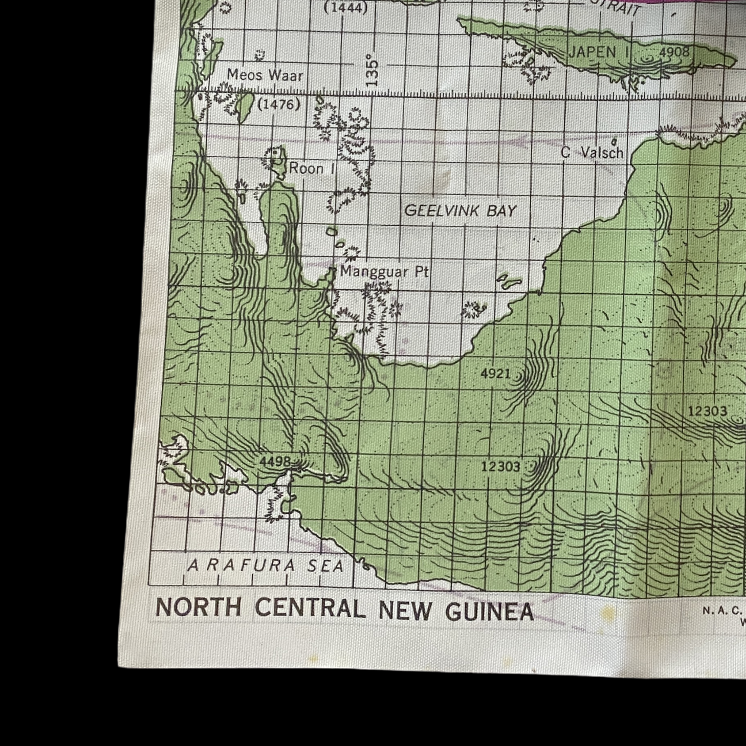
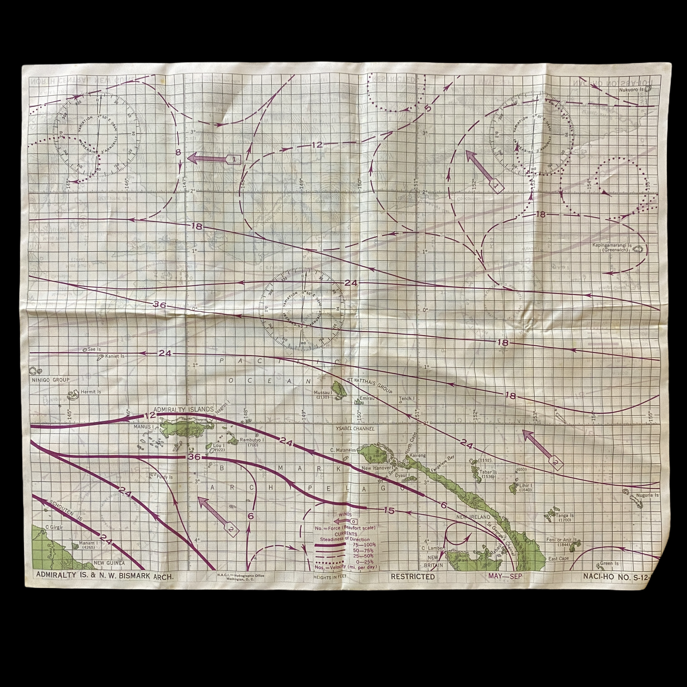
This map is titled ‘North Central New Guinea’ and on the reverse ‘Admiralty Islands & N. W. Bismark Arch’. The map is meant to be waterproof and specifically features some of the most notable islands of the Pacific Theater that saw intense air combat, naval, and air fighting such as….
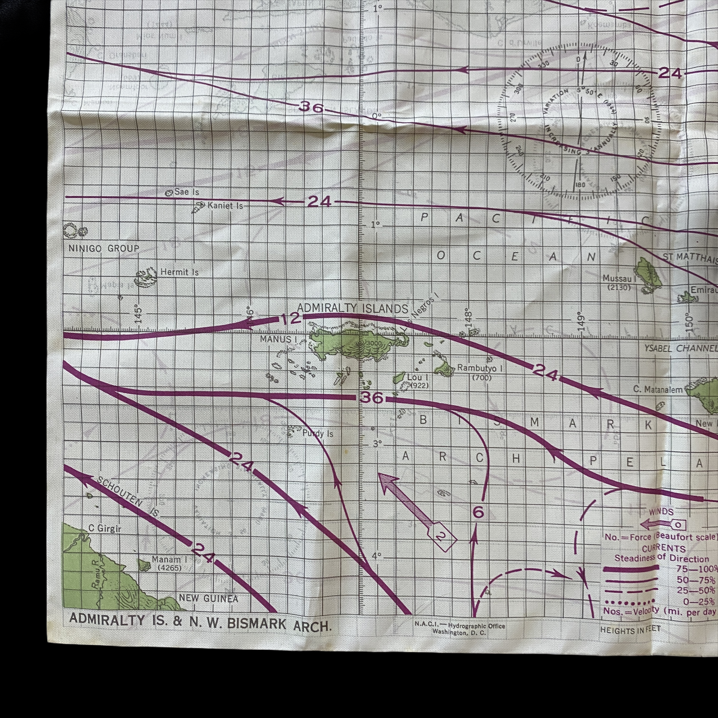
New Guinea
Admiralty Islands
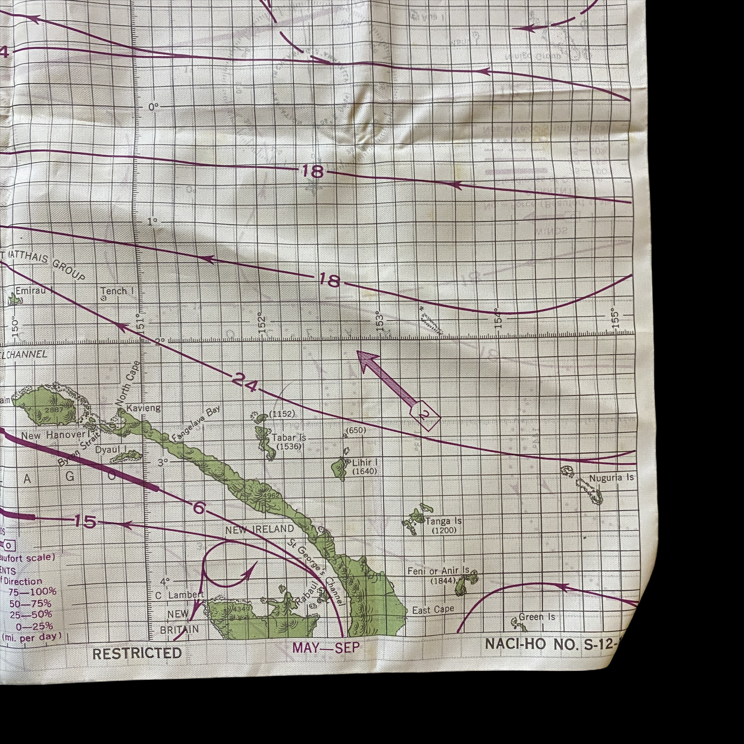
New Ireland
New Britain
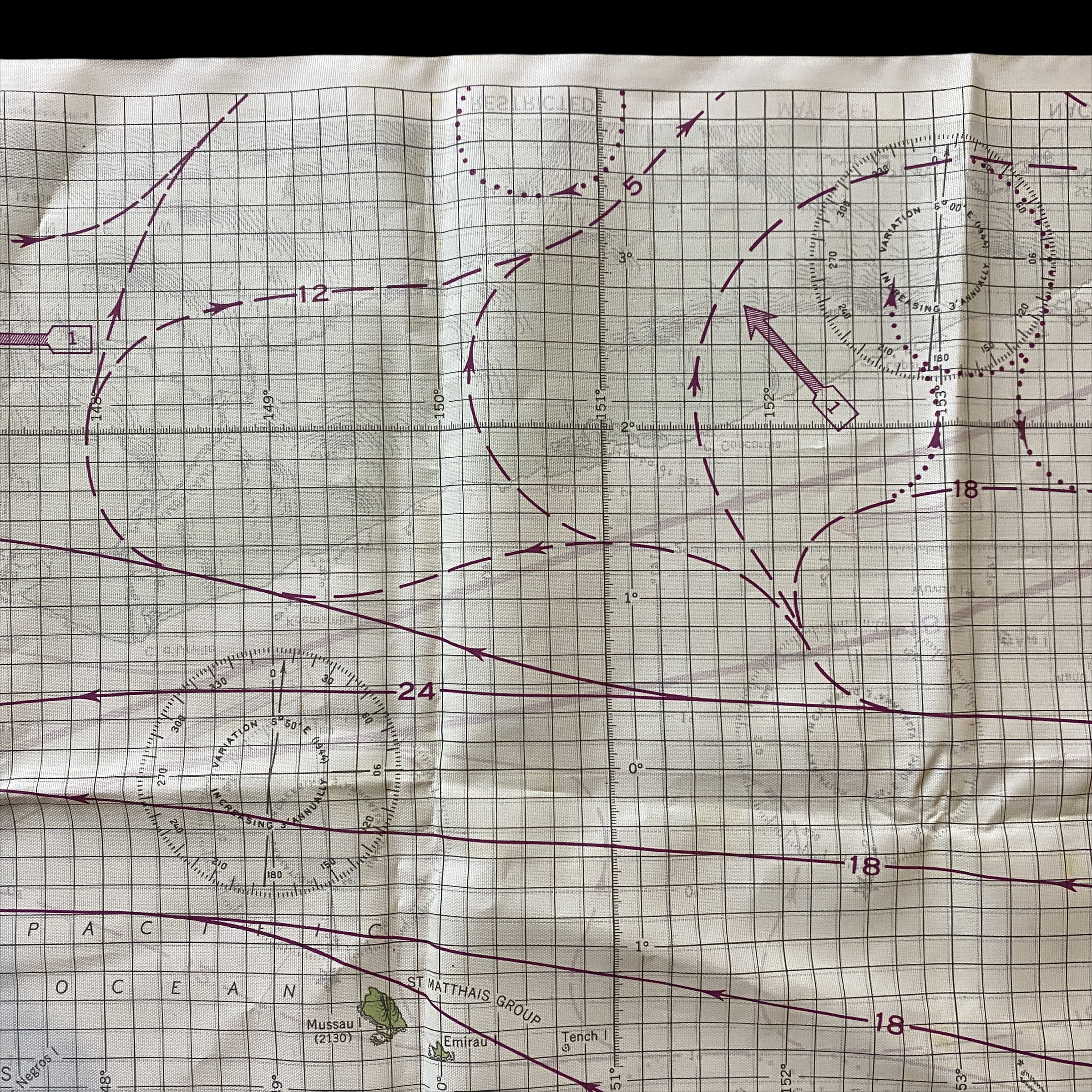
The background color of the charts is white with cultural features in black and land masses in green. The map does not include the more elaborate elevation tints common on many AAF maps, although they do include rough elevation contours lines. At the October 1943 conference, the Navy representative agreed to also include the inland cultural features on the charts for the benefit of the Thirteenth Air Force, which also operated in the areas covered by the charts. The charts are all made on the standard Mercator projection and were printed on rayon acetate.
To expedite their initial distribution, a minimum quantity (1,300 copies each) of the first six, double-sided charts were distributed to aviation units of the Pacific Fleet in the winter of 1944 without current and wind data because the data was not available in the form required at that time. The first six charts issued were: (1) S12-20&16 / S12-9&26, (2) S12-11 / S12-8, (3) S12-1&25 / S12-23&25, (4) S12-19 / S12-2, (5) S12-14 / S12-2, and (6) S12-21 / S12-29&22.
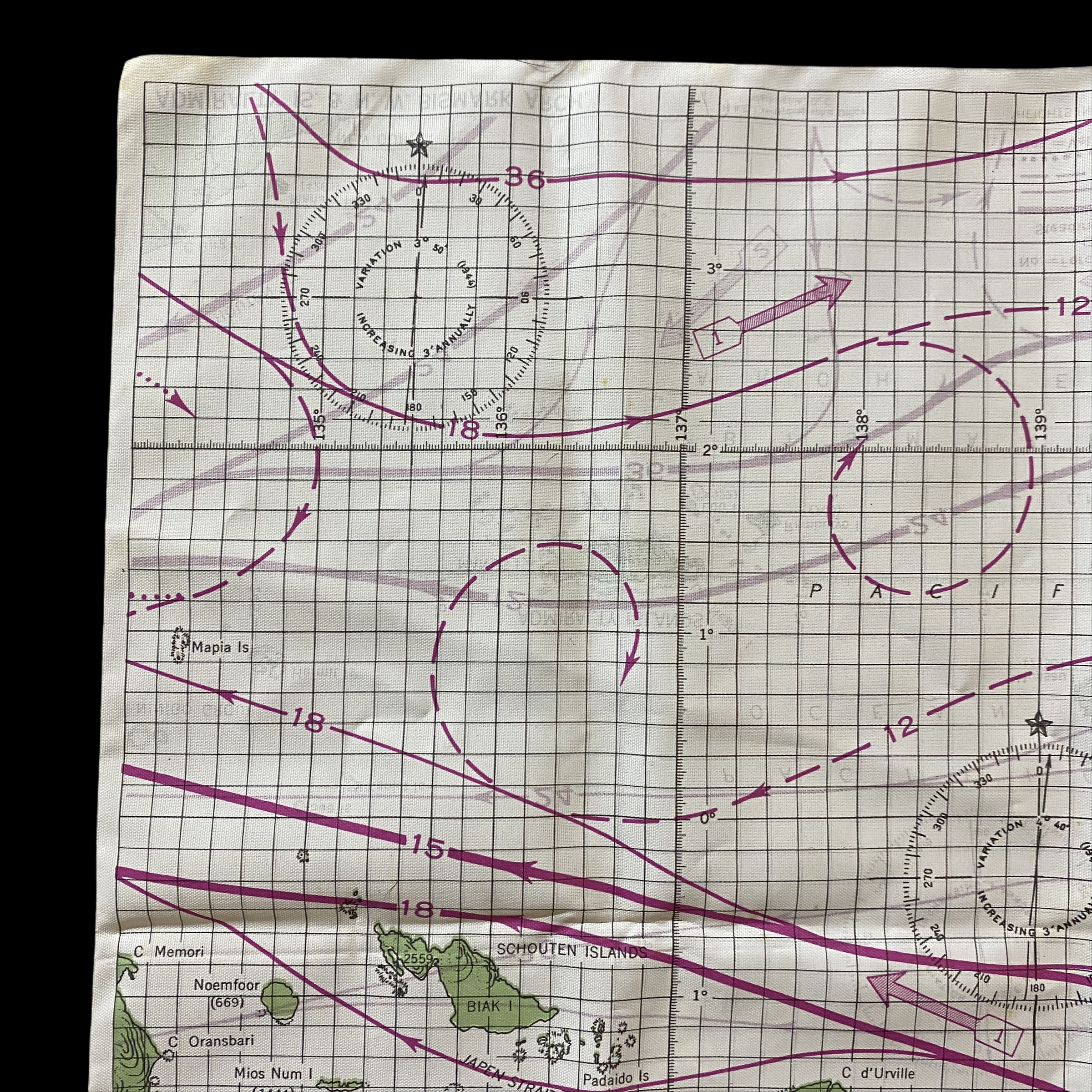
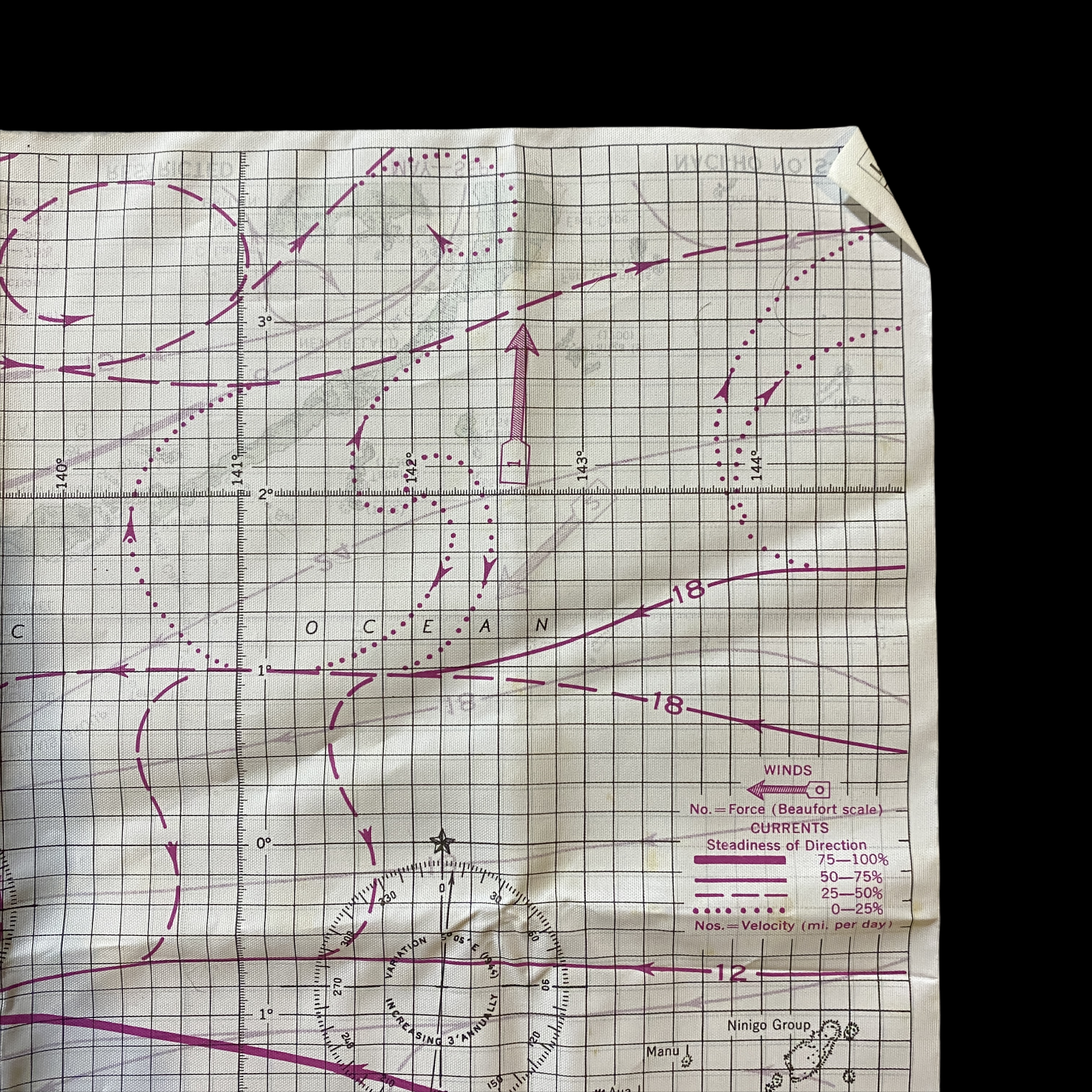
WHAT THE CHARTS SHOW …
The streamline on the handkerchief charts show the average current near the surface. The arrows on the streamlines indicate the average direction of flow, and the numbers indicate the average speed of the current in nautical miles per day.
The heaviness of the streamlines shows the steadiness of the current, that is, the percentage of the time that the current actually flows in the average direction. The heavier and more solid the line, the more you can rely on the current which it shows.
The shaded arrows on the charts give the average wind direction for each area. The numbers on the arrows show the average Beaufort force of the wind.
The direction and speed of the current will vary somewhat with wind force and direction. When the wind has been blowing for several hours, with the direction and force indicated by the arrow nearest your position, the current will flow about as shown on the chart. If the wind has been blowing in a different direction or at a different speed, the actual current will be a combination of that shown on the chart with the current set up by the wind.
Currents near shore will usually differ in speed and direction from those prevailing offshore. Such currents nearly always flow parallel to the beach and are mainly due to the tide, that is, they fluctuate in speed and often reverse direction every 6 or 12 hours.